Post by corsair67 on Jul 24, 2007 15:08:23 GMT 12
From The Australian.
Hopping mad over change of logo.
Simon Canning and Steve Creedy | July 24, 2007
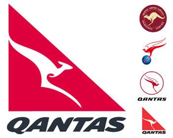
THE new Qantas "big foot" logo to be unveiled today has been rubbished by the designer who clipped the wings of the iconic flying kangaroo logo more than 20 years ago.
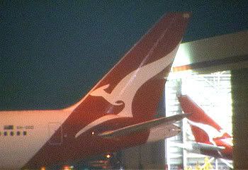
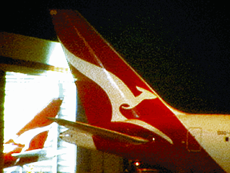
Qantas yesterday reluctantly confirmed that an aircraft tail caught by a television crew featured the new logo it intends to unveil today along with new seating for its Airbus A380 superjumbo, including a premium economy section.
It is understood the airline also intends to change the lettering on the side of its aircraft as part of the overhaul.
But initial reactions suggest the logo changes will be less than enthusiastically received. Ron Dyer, who with Tony Lunn introduced the wingless kangaroo in 1984, was dismayed when shown the new design by The Australian yesterday.
Mr Dyer questioned why Qantas would waste up to $100 million changing the logo on its fleet for what he described as an inelegant design. "Jesus Christ, there is nothing stylish about that kangaroo whatsoever," he said. "If you only knew how long it took us to get that whole thing worked originally.
"What do I think of it? What is it?"
Design agency Hulsbosch has spent 18 months working on the new kangaroo but even before its unveiling the logo has come in for a hammering from design and advertising experts, with one executive likening the new logo to a pterodactyl and the comic kangaroo from the Warner Brothers cartoons of the 1950s.
Advertising and design specialist John Ford of The One Centre said the new logo lacked the elegance of the kangaroo that had graced the tails of Qantas planes since 1984. "Dare I say it, it looks more like a pterodactyl than a flying kangaroo," Mr Ford said.
Garry Horner, creative director of Whybin TBWA in Sydney and one of Australia's most acclaimed advertising men, criticised the decision to move away from a logo people had come to love in favour of the giant-footed roo he said looked comical.
Mr Horner described the logo as unbalanced and warned iconic brands such as Qantas changed logos at their peril. "I think people find great comfort in the iconic images of the brands they purchase or use. It was a great logo and if it's not broken, don't fix it."
Ken Cato, who tweaked the Lunn-Dyer design for the airline's 75th anniversary in 1995, described the big-foot logo as ugly.
Mr Cato said he would have liked to have seen the return of the winged kangaroo -- an image he said that had mystical qualities.
However, sources close to Hans Hulsbosch, head of the agency that created the new logo, defended the big-foot design, which had been forced by the narrowing tail designs of the new generation of jets.
"We found with the no-paint zones on the A380, where the foot went through the tailplane, it looked as if it had been amputated," the source said.
"People probably didn't notice, but the kangaroo logo has been reworked to fit into the shrinking space over time."

