|
|
Post by Ykato on Jun 11, 2013 15:58:32 GMT 12
|
|
|
|
Post by kiwithrottlejockey on Jun 11, 2013 16:52:37 GMT 12
|
|
|
|
Post by Naki on Jun 11, 2013 17:06:05 GMT 12
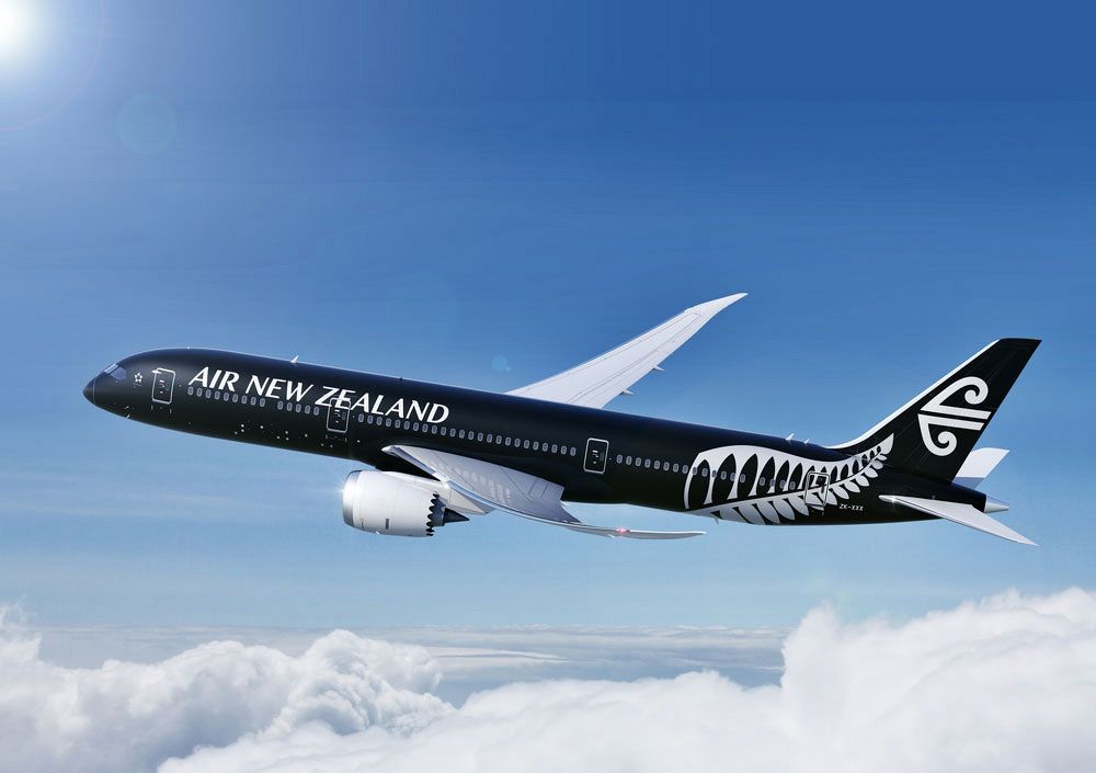
I like those..I wonder whether the mostly black painted 787 affects the composite structure?
|
|
|
|
Post by alexjc on Jun 11, 2013 20:10:45 GMT 12
Anyone else getting tired of the Air New Zealand "All Blacks" theme? How many times is this airline going to dabble with what is now a ruined livery?!!!
|
|
|
|
Post by corsair67 on Jun 11, 2013 20:39:38 GMT 12
Anyone else getting tired of the Air New Zealand "All Blacks" theme? How many times is this airline going to dabble with what is now a ruined livery?!!! +1000 |
|
|
|
Post by sqwark2k on Jun 11, 2013 20:49:48 GMT 12
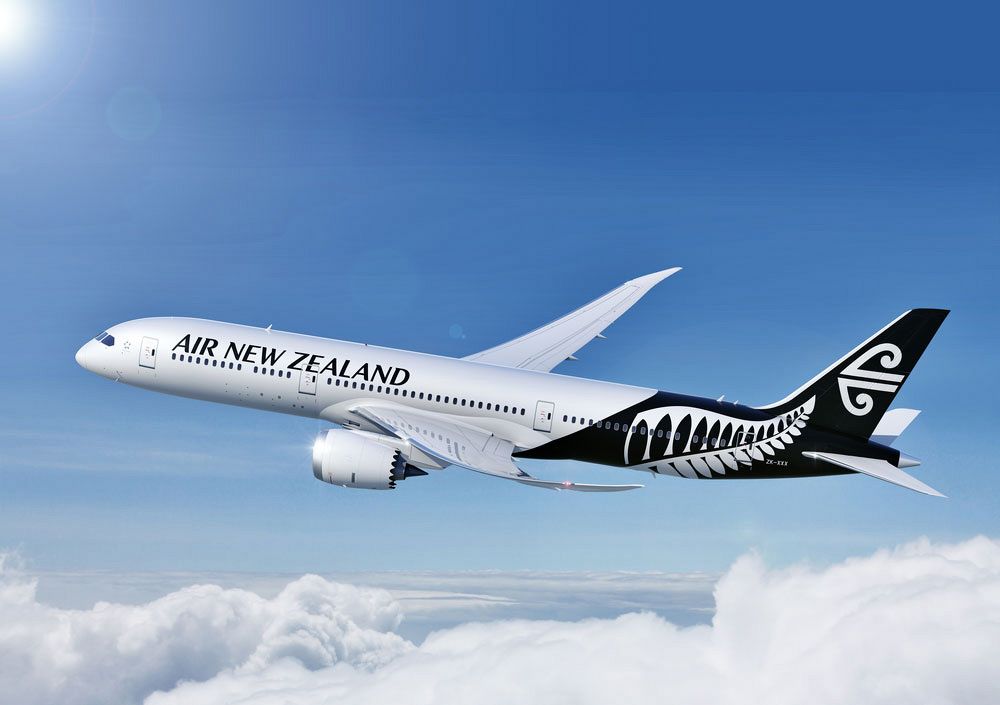
Not at all, the black scheme is doing a lot for brand recognition around the world. The Teal/ Pacific wave scheme is well and truly past it's use by date. The initial black tail scheme was not a good start but this latest livery is spot on. The Silver Fern is synonymous with NZ and looks pretty wicked in this version.
Wondering if it's going to be the 4th ATR72-600 or a new Sharklet A320 which will be first in the livery.
|
|
|
|
Post by nzav8a on Jun 11, 2013 21:02:42 GMT 12
Wondering if it's going to be the 4th ATR72-600 or a new Sharklet A320 which will be first in the livery. A320 ZK-OJC is currently in the Christchurch paint hangar. Interesting that the 2 domestic A320's OJQ & OJS have only just been painted over the last 2 weeks into the boring white with black tail scheme. |
|
|
|
Post by FlyingKiwi on Jun 11, 2013 21:43:53 GMT 12
I think this livery is not too bad - the fern and Koru look a bit crowded together but it's still a step forward from the plain black tail. The overall black 787 will look stunning I think.
|
|
|
|
Post by DragonflyDH90 on Jun 11, 2013 21:56:10 GMT 12
I like those..I wonder whether the mostly black painted 787 affects the composite structure? I would have similar concern. |
|
|
|
Post by 11SQNLDR on Jun 11, 2013 21:58:33 GMT 12
Both exciting new schemes, well done Air NZ  |
|
|
|
Post by Dave Homewood on Jun 11, 2013 23:53:49 GMT 12
I have no problem with the All Blacks brand sponsoring Air New Zealand, it's all good if it keeps the airline flying.
I'm more concerned about how Air New Zealand managed to bend the wings like that. Overstressed?
|
|
|
|
Post by classicman on Jun 12, 2013 3:00:16 GMT 12
Other way around! Air NZ is a major sponsor of the All Blacks ie. the airline spends money on the All Blacks.
But why should it be good for something to help "keep the airline flying"? An airline is a business at the end of the day - nothing more, nothing less.
Air NZ has been bailed out by the taxpayer once already. If it can't make money, an airline that can will replace it. Simple economics.
|
|
|
|
Post by tfly on Jun 12, 2013 3:24:36 GMT 12
I'm led to believe that 787 wings can bend up to 12 feet in normal operation - above the height of the fuselage according to one of our pilots who flys them (Thomson Airways)
|
|
|
|
Post by Dave Homewood on Jun 12, 2013 3:30:50 GMT 12
No you see it the wrong way round. Using the All Black livery and the silver fern ups the airline's image that is projected upon the world. The aircraft are now standing out massively in the crowd, far more than the boring old colours, and putting New Zealand on people's lips wherever they go.
Good branding brings in business, and they must have worked out this is good business to use the recognised and established branding that is already world renowned, otherwise they would not be spending the money repainting the fleet. The All Black livery and branding are already known on the world stage, people all across the world recognise the colours as being essentially kiwi.
So in borrowing the recognised branding of one of the world's most recognised and loved sporting teams they seem to be making money off it, thus keeping the airline flying.
Maybe the opposition should paint their planes in Manchester United red?
|
|
|
|
Post by lumpy on Jun 12, 2013 7:22:54 GMT 12
Anyone else getting tired of the Air New Zealand "All Blacks" theme? How many times is this airline going to dabble with what is now a ruined livery?!!! What " All Blacks " theme ? I see a stylised silver fern ( isnt that our netball team ) , and a Koru ( which has a long association with Air NZ's own corporate branding . Perhaps its just the colour of black and white , which I personally quite like as they are nice bold contrasting colours and look quite sharp together .( I do prefer the mostly white scheme though )  |
|
|
|
Post by conman on Jun 12, 2013 9:06:28 GMT 12
I have no problem with the All Blacks brand sponsoring Air New Zealand, it's all good if it keeps the airline flying. I'm more concerned about how Air New Zealand managed to bend the wings like that. Overstressed? They're designed to flex like that, just like carbon fibre glider wings have for many years, the flexing helps to give a smoother passenger ride than stiff wings, no fatigue issues until they reach a certain point then they just explode catastrophically ! Also concerned about painting composites in dark colours, this is the reason most gliders are predominantly white , if this has proved to be a false concern I' m keen for an all black paint scheme on my glider will look right sinister , I think it is also a hi Viz scheme so good for safety. |
|
|
|
Post by Mustang51 on Jun 12, 2013 9:29:20 GMT 12
Personally I love the look. It is distinctive, very Kiwi and sharp. I remember at Wanaka when the "other" black scheme was displayed the ANZ Chief Pilot recalled that in the USA a comment was made over the ground freq from a US Airlines cockpit words to the effect of "Nice Paint Job Kiwi...". For me I fly Air NZ whenever I am flying overseas. The paint job just adds to the effect
|
|
|
|
Post by shorty on Jun 12, 2013 10:01:03 GMT 12
Another link with the airlines founding and history cast aside with the dumping of the teal blue trim (did none of these PR muppets know the connection between TEAL and teal blue?)
The companies proud heritage is obviously of no interest to the bean counters.
Remember when there was the shotgun marriage of NAC and ANZ there were assurances that the NAC godwit would be still carried (albeit in smaller form) but that didn't last and niether did the TEAL Maroro logo although that did survive by the cockpit for a much longer time.All gone in favour of something that looks like a white feather!
|
|
|
|
Post by TS on Jun 12, 2013 10:43:42 GMT 12
Another link with the airlines founding and history cast aside with the dumping of the teal blue trim (did none of these PR muppets know the connection between TEAL and teal blue?) The companies proud heritage is obviously of no interest to the bean counters. Remember when there was the shotgun marriage of NAC and ANZ there were assurances that the NAC godwit would be still carried (albeit in smaller form) but that didn't last and niether did the TEAL Maroro logo although that did survive by the cockpit for a much longer time.All gone in favour of something that looks like a white feather! Or Fish Bone ( as Denis Conner put it years ago) EEHH BRO.  |
|
|
|
Post by Dave Homewood on Jun 12, 2013 11:50:36 GMT 12
But teal blue is so 1960's man, like get with the times, people renovate their houses, upgrade their cars, change their hairstlyes, buy new clothes, etc., all the time. Why should a multimillion dollar flagship business of the nation be esxpected to stay with daggy old colours of the past rather than keeping their corporate look fresh and vibrant? We're not a communist block country.
I have lost count of how many times in my lifetime the cabin crew have changed their outfits (and their names, when I first flew they were hostesses and stewards!). Also the style, colour and desig of the airline seats have changed dramatically, for the better too. And the airline food has changed tremendously. No-one seems that worried about these corporate changes happening to alter the image, so why not the outside of the planes.
|
|